I try not to buy a lot of different colors in watercolor since, in theory, you can mix all the colors you need from a rather limited array of colors. In reality this isn’t totally true (mixing bright or pale pinks is not easy for instance, and when you paint a lot of trees – a LOT of trees – using a range of prepared greens makes life a lot easier) and you know – you watch some video or wander into the art supply store and suddenly you’ve got a tube or two more in your stash.
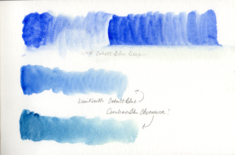
This friends is how I recently ended up with a group of greys (warm, cool granulating, etc) and a set of new Winsor and Newton transparent colors and a couple tubes of Cobalt Blue, Deep.
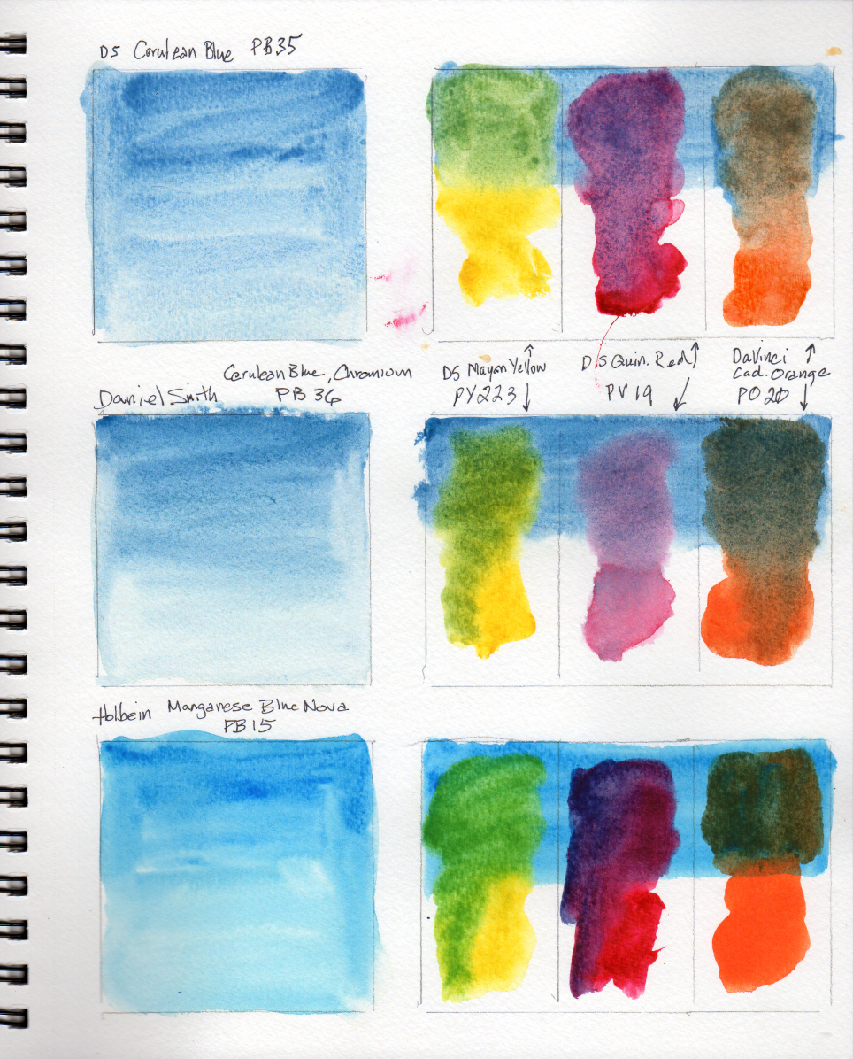
And this is why every once in awhile you have to take time to mix colors together and find out what happens. In class last week, I asked if I was the only person who wasn’t a big cerulean fan. Only the teacher responded, without judgement!, with a great explanation of why cerulean, as a granulating color makes great color mixes and provides texture. He also explained the differences between that and the other two I have tried. He did say that different people see color differently. To me, it’s a little greyed.
I resolved to try it again after I use what’s in my palettes. My test was to add yellow and red to make a green and purple and then to use a complementary orange to see what happened.
The idea of cobalt deep surprised me – cobalt is one of the basic, everybody has it and uses it, colors but deep – very granulating, intense… oooh sign me up. I did find a Winsor & Newton version – lovely.
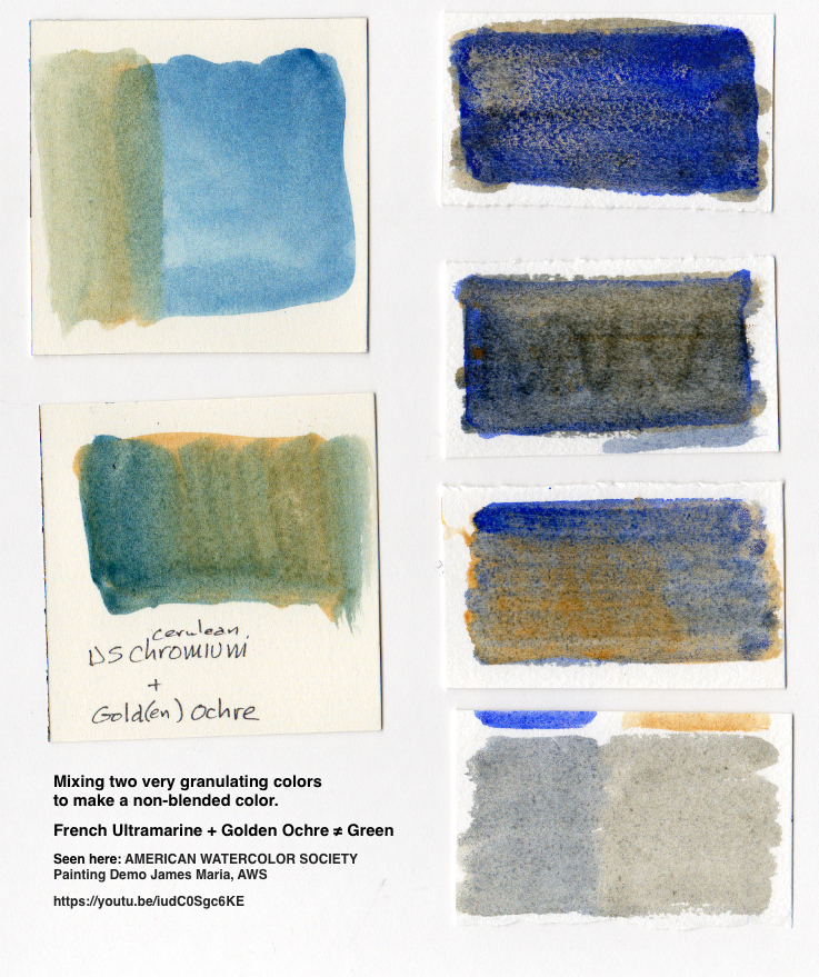
But that’s not why I’m here. I’m here to say that sometimes you see something on the interwebs and think – that’s not true, is it? the man demonstrating at the American Watercolor Society did a whole scene using a bunch of mixed values all made of French Ultramarine and Golden Ochre. He explained that they don’t blend in the way that you might expect, to make something greenish. Instead, they blend as two suspensions and then granulated out into a mixture of blue and ochre particles. Mind blown. (also saw Cobalt Deep used similarly when creating shadowed areas using it and another color)
I search for a “gold(en)” ochre since all mine are yellow or just ochre and most definitely make green. Once in hand, this is what happened.



Pingback: Playing with color |
Really fascinating! I had no idea blending colors in this medium was this complex!